Below we review some diagnostic plots available in Stata, and we demonstrate how to overlay plots. We use auto.dta, which contains pricing and mileage data for 1978 automobiles.
We are interested in modeling the mean of mpg, miles per gallon, as a function of weight, car weight in pounds. We can use twoway lfitci to graph the predicted miles per gallon from a linear regression, as well as the confidence interval:
 sysuse auto, clear
 twoway lfitci mpg weight
To see how these predictions compare to our data, we can overlay a scatterplot of the actual data
twoway lfitci mpg weight || scatter mpg weight, title(MPG as a function of weight)
which produces the following graph:
We could have also created separate graphs for domestic and foreign cars with the by() option. See graph twoway lfitci in the Stata Graphics Reference Manual for details.
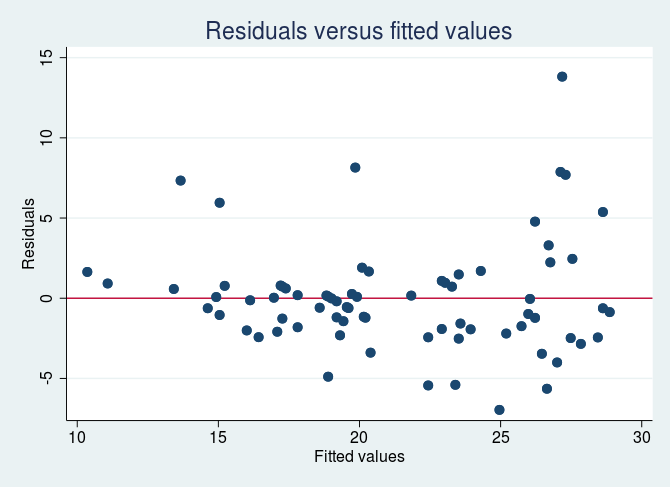
There are multiple diagnostic plots available for use after regress. Here, we use rvfplot to graphically check for a relationship between the residuals and fitted values from our model. We regress mpg on weight and then issue rvfplot.
regress mpg weight
rvfplot, yline(0) title(Residuals versus fitted values)
The commands above produce the following graph: